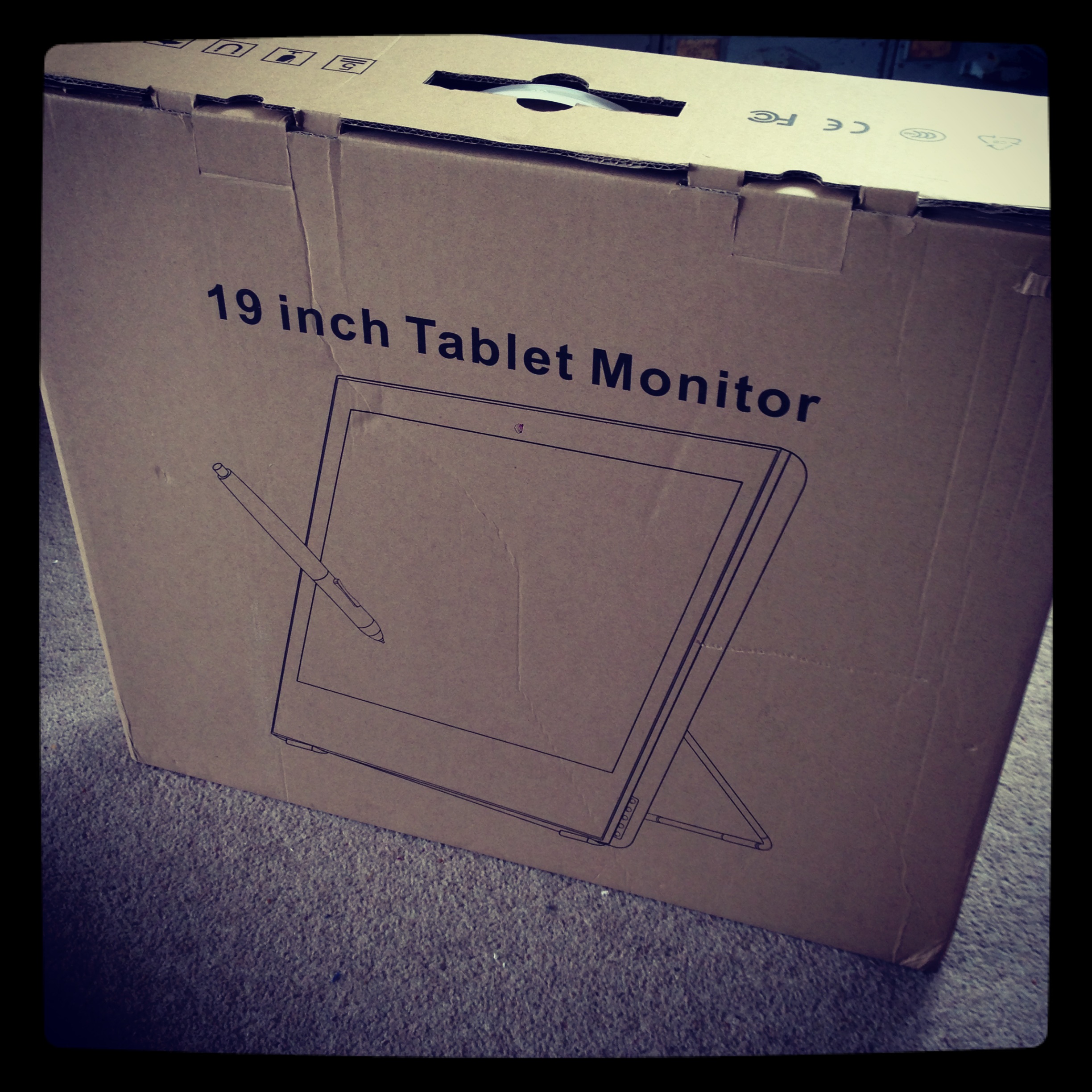
Allright, so before I decided weather or not it was possible to do any secondary animation on computer, I had to check that I could replicate the drawings fully digitally.
For this I would need a brush (in photoshop, or what ever other software) that replicates the way my pen behave on paper.
This actually means that I need to replicate what the drawn lines look like once scanned.
Step 1: What to replicate

I start by drawing various type of strokes: Slow, fast, overlapping, light and heavy strokes.
Step 2: Understanding parameters

The amount of parameters can be overwhelming but if you take them one by one it's actually straight forward.
- First you need to choose your brush size to match the pen. You won't be able to change the size of your brush once its finished, it will look odd. If you need a bigger brush, youll need to scan a bigger pen and create a new brush.
From now on stroke on the right is pen stroke on the left is "cg"

I've set the hardness to 33% because the pen is not drawing perfectly sharp.
Note: the size of your brush depends on the size of your document (because it's set in pixels) here i'm working at 300 dpi. If I was at 600 dpi i'd have to scale my brush up twice.
I keep it round because it's a classic pen.
- Then lets set the shape dynamics:

The size jitter "randomise" the size of the brush in the range you set (here the brush can be 50% bigger or smaller). The size is also control by the pen pressure and I've put a minimum size so the brush doesn't disappear when I'm drawing lightly. (Here you need to match the diameter of your lightest pen stroke)
The size jitter represent the flow of ink of your pen and the randomness due to the paper, not the wobbliness of your stroke due to how you draw. I am not using the angle jitter and roundness jitter since my brush is round.
- Scattering moves the brush in different axis, i am not using it here.
- Textures and Dual Brush aren't useful in this case.
- Color Dynamics

Color dynamics gives your stroke a more natural/scanned look. Scanner never scan black as black, it's multicolor darkness. Here my foreground color is a very dark blue and my background color is a very dark red. They are being mixed randomly at 57%.
A brush is just a succession of dots really close to each other. What the randomizing option does is give each dot a different value, in hue, brightness and saturation. The purity seams to multiply the effect. At -100 the brush turns black and white...
Note that if you un-tick "apply per tip" the color changes is applied to the whole stroke. It can give some nice effects.
- Transfer

Here you'll need to set the opacity and flow of your brush. As you can see on the strokes on the left, the pen doesn't cover the paper regularly (more or less ink comes up).
The opacity and flow are both transparency but one is applied by stroke, the other one is applied as you draw. With opacity you need to lift your pen and draw again to have a color twice less transparent whereas with flow if you draw twice in the same place in a single stroke, this place will be twice less transparent.
The important thing at this stage is to play with the pressure of your wacom pen. You might end up really easily with a completely transparent brush when your not putting a lot of pressure on your pen. You need to set the minimum opacity to something that suite you.
- brush pose is some kind of 3d ness of your pen on the wacom. lets not bother with it.
- The next parameters have no options. I change them on/off as I draw depending on the effect I want to give:
noise:

Adds sharp noise to the stroke.
- Wet edge

Makes the center of the brush lighter and the edges darker
- build-up is some kind of airbrush option.
- Smoothing smooth you brush stroke, I wouldn't use it with a tablet if you want a hand drawn feel...
At this point you should have a brush fairly similar to your pen:
red arrows show the cg brush strokes.

The only option i couldn't find is to have more opacity/flow at the beginning of a stroke, I think it would look much more natural. If anyone knows how to do this, let me know!
Sorry for the bad english, this took more time then i though and I need to go back to work...
Cheerios

 +
+  =
=
 After reading
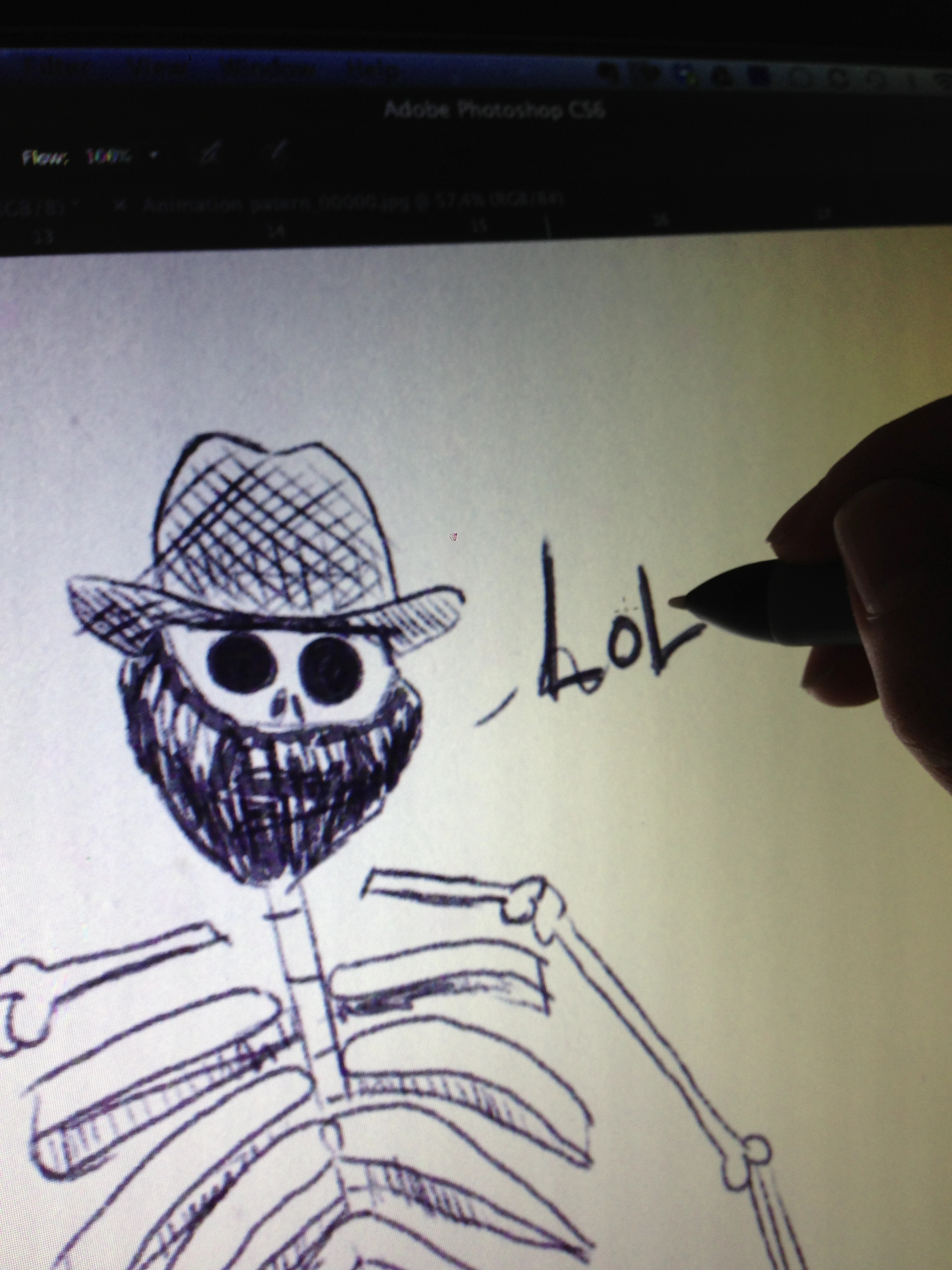


")